Goal: Turn your blueprint into a beautiful, fully interactive Linktree clone.
What we're doing
Right now you have a blueprint and an empty project. In the next few minutes, you're going to turn that blueprint into a real, working app.
We're building everything — the landing page, the public profile page, the entire dashboard with all its tabs, a link editor, an appearance picker, a live phone preview. All of it.
We’re using fake data for now so you can focus on building a beautifully designed, working app before we connect the database and payments in the next modules.
The problem with AI-generated design
Vibe coded apps look like vibe coded apps. Everyone can tell.
The purple-to-blue gradients. The oversized generic icons that look like free clip art. The safe, corporate rounded cards with too much shadow. The seven shades of gray. The meaningless stock-photo hero sections.
This is design slop. We're not doing that.
We avoid this by adding a clear design framework in the prompt we are giving to the agent.
Before you start
Step 1: Build the app
Copy this prompt and paste into your Agent. This is a big one — it tells the Agent exactly what to build, down to the pixel.
Link-in-Bio Build Prompt — v2 (UI-only, no backend)
Build a complete, working, designer-quality link-in-bio app (Linktree-style, better-looking) in one pass. The whole product UX ships end-to-end against local React state. Four concerns — Supabase (database), authentication, Stripe (payments), Vercel (deployment) — are added in later modules and MUST be STUBBED, not implemented.
Stubs vs deletes:
Database (Supabase) — use hardcoded seed data and React state. No Supabase client. No API calls. No persistence across refreshes.
Authentication — do NOT create /login or /signup routes. When the customer clicks Save or Publish, show a modal (LoginPromptModal) with email/password fields and a "Continue" button. "Continue" just closes the modal and runs the success path (toast).
Payments (Stripe) — Save and Publish buttons exist and look final. Publish does not open Stripe Checkout; it flips isPublished=true in state and shows a toast.
Deployment (Vercel) — not this module.
Everything else works perfectly: dashboard editing, drag-and-drop reordering, visibility toggles, theme switching, image and background uploads (as data URLs), live preview updates on every keystroke, the public page at /page/[username], and the landing page with real interactive example pages.
This is a three-part prompt. Read Part 1 before writing a single line. Part 2 is the feature and design spec. Part 3 is the checklist to re-read before you claim you are done.
PART 1 — ARCHITECTURE CONTRACT
Stack
Next.js (App Router, current version). This is NOT the Next.js in your training data — read node_modules/next/dist/docs/ for any routing/rendering API you are uncertain about. Use "use client" directives where needed.
React 19.
TypeScript.
Tailwind CSS v4 — imported via @import "tailwindcss"; at the top of globals.css. No tailwind.config.js. Use the @theme inline { ... } block in globals.css to expose custom CSS variables as Tailwind tokens if useful.
next/font/google — loads Instrument_Serif (weight 400) and Plus_Jakarta_Sans (weights 400/500/600/700). Expose both as CSS variables on the <html> element (--font-instrument-serif, --font-plus-jakarta).
react-icons — the ONLY source of brand icons (react-icons/fa, react-icons/fa6, react-icons/si). UI icons come from react-icons/hi2 (Heroicons v2).
@dnd-kit/core + @dnd-kit/sortable + @dnd-kit/utilities — for drag-and-drop reordering of links.
Forbidden
NO auth libraries (NextAuth, Clerk, Supabase client, anything).
NO image-crop libraries (react-easy-crop, cropperjs, canvas-based custom crop).
NO state libraries (Redux, Zustand, Jotai, Recoil). Use one React Context.
NO UI framework other than Tailwind (MUI, Chakra, shadcn/ui, DaisyUI, Mantine).
NO icon set other than react-icons for brand logos. NO custom SVGs or AI-generated glyphs for Instagram, TikTok, etc. NO circle-with-letter placeholders.
NO toast or modal libraries (react-hot-toast, sonner, radix-dialog). Build one <Toast> component and a simple open-prop modal.
NO alert(), confirm(), or prompt() — ever.
File layout (exact — use the _folder leading-underscore Next.js convention for non-routable directories)
app/
  layout.tsx                    # next/font, metadata, PageProvider wraps children
  globals.css                   # @import "tailwindcss", CSS vars, keyframes, link-card styles
  page.tsx                      # Landing page (/)
  page/
    [username]/
      page.tsx                  # Public page at /page/:username
  dashboard/
    page.tsx                    # Dashboard shell (sidebar + tab + preview + header)
    _components/
      DashboardHeader.tsx       # Logo, status badge, Preview + Save + Publish
      Sidebar.tsx               # Vertical tab list (desktop) / bottom bar (mobile)
      PreviewPanel.tsx          # Fixed right-column phone preview
      FullScreenPreview.tsx     # Overlay with Phone/Desktop device switcher
      LoginPromptModal.tsx      # Shown when Save/Publish is clicked
    _tabs/
      LinksTab.tsx
      ProfileTab.tsx
      AppearanceTab.tsx
      PaymentsTab.tsx
      AccountTab.tsx
  _components/
    PublicPage.tsx              # The rendered public-page view (REUSED 4x)
    PhoneFrame.tsx              # Pure-CSS iPhone frame (REUSED 3x)
    Toast.tsx                   # ToastProvider + useToast
    Toggle.tsx                  # Reusable switch control
  _lib/
    platforms.ts                # Icon table + detectPlatform(url)
    themes.ts                   # Color themes
    backgrounds.ts              # Background presets
    examples.ts                 # Seed data for landing-page example pages
  _state/
    PageContext.tsx             # PageProvider + usePage() + DEFAULT_DATA
Data types (define in _state/PageContext.tsx, import everywhere)
Every tab reads and writes via usePage(). NEVER drill state through props. NEVER maintain duplicate copies of page data in local tab state.
Inputs are controlled. They update PageContext directly on every onChange. Do not debounce. The preview must react to every keystroke.
Component reuse (if you find yourself building a second copy, stop)
<PublicPage> — renders the entire user-facing page (avatar, name, bio, social row, link cards, extra text, extra photo, publications, payment button, footer brand mark). Props:
Why animate=false matters: every keystroke in the dashboard updates props; if animations are on, the fade-in retriggers on every character. Turn them off inside previews.
Implementation: an outer container sized (innerWidth+24)*scale × (innerHeight+24)*scale; inside, an absolutely-positioned transform: scale(scale) wrapper at the unscaled frame size. This makes the scaled phone occupy correct layout space. Inside the inner screen (overflow-hidden), render {children} in a scrollable container.
<Toast> — one component. ToastProvider wraps the dashboard. useToast() returns { show(message: string) }. Render queue near bottom-center, 3s auto-dismiss, smooth fade-in/out.
<Toggle> — one reusable switch (coral when on, neutral when off).
_lib/platforms.ts — the single source of truth for URL → icon
Export a PLATFORMS array of { key, name, icon, color, match: (url: string) => boolean } and a detectPlatform(url: string): Platform function that iterates the array and returns the first matching entry, falling back to a generic "website" entry. No platform detection logic lives anywhere else.
Use this list exactly (every icon is a real import in react-icons, already verified):
accent drives the payment button, the selected-theme outline, and the active-tab indicator inside the dashboard sidebar. accentSoft is used for tinted backgrounds and shadows (never gray — shadows are tinted with the accent).
Also export DARK_BGS = new Set(["charcoal-dark"]). Any preset in this set is "dark": on dark backgrounds, <PublicPage> flips primary text to #FAFAFA and secondary to #CCCCCC, and uses a semi-transparent white card fill (rgba(255,255,255,0.08) with rgba(255,255,255,0.12) border) instead of the default glass-over-cream card.
V1 stub mapping (apply these substitutions wherever Part 2 mentions a deferred concern)
Part 2 spec says
V1 implementation
"/login" or "/signup" routes
DO NOT create. Not in the page list.
"sign up or log in first"
Open <LoginPromptModal> with email + password + username fields. Continue button just closes the modal and runs the success path.
"uploaded to Supabase Storage"
<input type="file"> → FileReader.readAsDataURL() → store the data URL string directly in state.
"crop it to a square in-browser"
No crop UI. Wrap the image in a border-radius: 50% container with object-fit: cover. Caption: "For best results, upload a square image."
"Stripe Checkout hosted page"
LoginPromptModal (mode="publish"). Continue flips isPublished=true and shows toast "Page published — you're live!"
"cancel subscription"
Static copy. No handler.
"delete my account"
Confirmation modal shown; Delete button just closes it.
"next renewal date"
Hardcoded string (e.g., "Renews April 18, 2027") for visual completeness.
RLS, env vars, security section
Omit. Not part of v1.
Save button: always opens LoginPromptModal (mode="save") the first time; Continue shows toast "Draft saved". Save does not persist anywhere.
Account tab exists and renders as if the customer is logged in (email, subscription, danger zone). Hardcode a plausible email (e.g., maya@corner.link).
PART 2 — FEATURE & DESIGN SPEC
The product in one sentence
Customers build one beautiful page at /page/:username that holds their profile, links, social icons, and an optional payment button. Visitors see the page; customers edit it in /dashboard.
Who it's for
Creators, freelancers, small business owners — anyone who wants one page for everything about them.
Free vs. paid model (simulated; see V1 stub mapping)
Anyone can open /dashboard and build a page — no account required to start. When they click Save, they're prompted to sign up (simulated modal), then the draft is "saved" (toast only). When they click Publish, same prompt, then the page flips to "Live at domain.com/page/username" (toast + status badge change). Real price is $12/year — mention in UI copy, don't charge.
Pages
/ — landing (marketing) page
/dashboard — all editing
/page/[username] — public page
NO /login, NO /signup in v1.
Public page layout (what visitors see)
The outermost wrapper of the public page MUST have min-height: 100vh and the background (gradient or solid) applied directly to it — not to a nested container. This ensures the background fills the entire screen even when content is shorter than the viewport. Never apply the page background only to a content column that stops at the last element. In globals.css, add html, body { background: transparent; } so that the default white body color does not bleed through below the wrapper when the user scrolls past the content.
Top to bottom, centered, max-width 480px, 20px page padding mobile / 48px desktop:
Avatar — 88px circle, 3px solid white border, subtle drop shadow, object-fit: cover, light-gray placeholder if unset.
Display name — Instrument Serif, 2rem mobile / 2.5rem desktop, letter-spacing -0.02em, line-height 1.1.
Bio — Plus Jakarta Sans, 1rem, line-height 1.5, text-secondary color, max-width 380px, centered.
Social icon row — horizontal, 16px gap, icons at 20px. Only platforms with filled-in values appear. Icon order: Instagram, TikTok, YouTube, X/Twitter, Facebook, OnlyFans, LinkedIn, Spotify, Website. Email becomes a mailto: if filled in (not in v1's default row).
Link cards — vertical list, 12px gap. See "Link cards" below.
Extra text (if set) — Plus Jakarta Sans, 0.9375rem, line-height 1.6, centered, text-secondary color.
Extra photo (if set) — full-width, border-radius: 16px, overflow: hidden.
Publications (if any) — small caps label "Featured in" (letter-spacing 0.1em, uppercase, opacity 0.7), then each publication title as a single line with a hairline underline.
Payment buttons — for each entry in payments.buttons where visible=true and url is not empty, render a wide button: theme accent color, white text, 14px top-padding, border-radius 16px, soft accent-tinted shadow, small yellow-heart emoji + button label text. Multiple buttons stack vertically with 12px gap. Visually distinct from link cards.
Footer — small "corner" (or your chosen app name) wordmark in Instrument Serif, muted.
Link cards (the core visual unit):
Background: rgba(255,255,255,0.85) with backdrop-filter: blur(8px)
Border: 1px solid rgba(255,255,255,0.5)
Border-radius: 16px
Padding: 16px 20px
Layout: flex row, left icon (20px), title centered (Plus Jakarta Sans 1rem, weight 500, color text-primary), right arrow icon (HiArrowUpRight from hi2, 14px, muted)
Transition: all 250ms cubic-bezier(0.4, 0, 0.2, 1)
Tap: scale(0.98)
If a link has an emoji, show that instead of the platform icon.
If the URL matches a platform, show that platform's icon; otherwise the generic link icon.
Dark-background variant (for charcoal-dark): flip primary text to #FAFAFA, secondary to #CCCCCC, card fill to rgba(255,255,255,0.08), card border to rgba(255,255,255,0.12).
Dashboard layout
Background: #F8F6F3 (warm off-white — intentionally different from the public page's cream, to distinguish the contexts).
Desktop: three-column flex under a fixed header.
Left: Sidebar (fixed width ~220px).
Center: active tab panel (max-width ~640px).
Right: fixed <PreviewPanel> containing a <PhoneFrame> with <PublicPage> inside (visible lg+ only).
Mobile: sidebar collapses to a bottom tab bar; PreviewPanel is hidden (previewing there is handled by the FullScreenPreview overlay via the Preview button).
DashboardHeader
Sticky-top, full width, white background with subtle bottom border.
Left cluster: app wordmark (Instrument Serif 1.25rem, linking to /).
Middle: page status badge. Unpublished → amber dot + "Draft — only you can see this". Published → green dot + "Live at corner.link/page/username" + small HiArrowTopRightOnSquare icon that opens /page/[username] in a new tab.
Clicking a tab updates local state in the dashboard component — no navigation, no route change. The dashboard is a single page.
Tab: Links
Heading: "Your links" (Instrument Serif, 1.75rem). Subheading (0.9375rem muted): "Add, reorder, or hide links. Changes reflect instantly in the preview."
+ Add Link button (primary coral, HiOutlinePlus icon). Click → the button collapses and an inline form appears in its place (same width). The form has:
URL input (required, placeholder "Paste your link here"). As user types, run detectPlatform(url) and show the matched platform's icon in a 44×44 coral-tinted swatch on the right side of the URL field. Below the URL row: "Detected as Instagram" helper text (updates live).
Title input (required, placeholder "What should this link say?").
Emoji input (optional, 4-char max, placeholder "Optional: pick an emoji instead of the auto icon").
Primary "Save Link" + secondary "Cancel" buttons.
Existing links list: each row shows, left to right:
Drag handle (HiOutlineBars3, gray, cursor-grab)
Platform icon OR emoji (28px box)
Title (1 line, bold) + URL (1 line, muted, truncated)
Toggle switch (visible/hidden on public page)
Edit icon button (HiOutlinePencil) — clicking swaps the row for the inline form pre-filled
Trash icon (HiOutlineTrash, error-red). Clicking does NOT open a modal or confirm(). It swaps the row's right side for inline "Delete" (destructive) + "Cancel" buttons.
Drag-and-drop: @dnd-kit with PointerSensor (activation distance 5px, so clicks don't trigger drags) and KeyboardSensor. SortableContext with verticalListSortingStrategy. On onDragEnd, use arrayMove and call reorderLinks(ids). The drag handle is the ONLY drag trigger — not the whole row (so toggle and edit remain clickable).
Empty state (no links): dashed-border card, "No links yet. Add your first one above." (no blank white box).
Tab: Profile
Heading: "Your profile". Subheading: short sentence.
Avatar upload: circular 96px upload area at the top. Shows current avatar or a HiOutlineUser placeholder. Click → file picker (JPG/PNG/WEBP, 5MB max). On select: FileReader.readAsDataURL() → setProfile({ avatar: dataUrl }). NO CROP UI — rely on CSS object-fit: cover. Small caption below: "Square images look best."
Display name — text input, required, max 40 chars, character counter below ("24/40").
Bio — textarea, max 200 chars, character counter.
Social Profiles section header, then one labeled input per platform (Instagram, TikTok, YouTube, X/Twitter, Facebook, OnlyFans, LinkedIn, Spotify, Other website). Each input has the platform icon on the left and accepts a full URL.
Extra info (optional) — textarea, max 500 chars, helper: "This appears below your links as a text section."
Extra photo (optional) — image upload (same FileReader pattern).
Publications / Press — repeatable row group, up to 10. Each row: Title + URL inputs and a trash icon. "+ Add publication" button adds a row.
NO per-tab save button anywhere in this tab. The global Save button in the header saves everything.
Tab: Appearance
Heading: "Appearance".
Background section: a responsive grid of 48×48 rounded swatches, one per preset. Each swatch previews its gradient/color. Selected swatch has a 2px solid #E8735A outline with a 2px offset. Two trailing entries: "Upload your own" (opens file picker; on upload → data URL in customBg, backgroundId = "custom-image") and "Solid color" (opens a native <input type="color"> or small inline color picker; value → customBg, backgroundId = "solid"). Clicking a swatch immediately applies — no confirm step, no save button.
Color Theme section: six pill-style buttons (Warm Coral, Ocean Blue, Forest Green, Dusty Rose, Midnight, Golden Hour). Each pill shows a small colored dot + the theme name. Selected pill has the accent color as background, white text. Click → updates appearance.themeId. Preview updates immediately.
No per-tab save button.
Tab: Payments
Heading: "Accept payments from your visitors". Subheading: "Add one or more Stripe payment links — each becomes a button on your page."
Repeatable row group, exactly like the Publications section in the Profile tab:
+ Add payment button button (primary coral, HiOutlinePlus icon). Click → appends a new row with empty fields.
Each row contains:
Stripe payment link URL input. Placeholder https://buy.stripe.com/.... Helper: "Paste your Stripe payment link here." A small external-link icon links to stripe.com in a new tab.
Button label input, max 40 chars. Placeholder: "e.g. Buy me a coffee, Support my work, Book a session".
Show/hide toggle — off hides this button on the public page even if URL is saved.
Trash icon (HiOutlineTrash) — removes this row.
Live mini-preview below each row showing exactly what that button will look like — styled in the current theme's accent color with the entered label.
Buttons also hidden whenever their URL is empty, regardless of toggle.
No upper limit enforced in v1 (let them add as many as they want).
No per-tab save button.
Tab: Account
Heading: "Account".
Your handle — at the very top of the tab, before email, show a read-only "Your link" row: label "Your public link" with the full URL displayed as corner.link/page/[username] (using the profile.username from state). Style it as a pill or a soft card with a copy-to-clipboard icon button (HiOutlineClipboard) on the right — clicking it copies the URL and shows a "Copied!" toast. This is how users know and share their handle.
Email address — read-only text (hardcoded in v1, e.g., maya@corner.link).
Subscription — card showing status. For v1, show a "You're on the free plan" block with an "Upgrade — $12/year" primary button; OR, if you want to show the paid state instead, show "Plan: Corner Pro · Renews April 18, 2027" with a text-only "Manage subscription" link. Either is fine for v1 — be internally consistent.
Danger Zone — card with a left-red border (border-left: 3px solid #D94F4F). Contains a secondary "Log out" button and a destructive "Delete my account" button. Delete → modal confirming "This will permanently delete your page and all your data. This cannot be undone." with Delete + Cancel. Both buttons just close the modal in v1.
Preview behavior
Two modes, both always available:
Mode 1 — inline phone preview (right column, desktop only). Always visible. Uses <PhoneFrame> with innerWidth=320, innerHeight=640, scale=0.95 (or similar — pick values that fit your column). Inside the frame: <PublicPage ... animate={false} interactive={true} />. Every edit updates instantly.
Mode 2 — full-screen preview overlay. Triggered by Preview button. Renders as a fixed full-viewport overlay with a dark-tinted backdrop (rgba(0,0,0,0.6) with blur).
Overlay content:
Top bar: two pill buttons "Phone" / "Desktop" (device switcher). Phone is default. A Close button (HiOutlineXMark + "Close" label) on the top-right.
Phone mode: centered <PhoneFrame> at ~innerWidth=390, innerHeight=780, scale=0.8 with <PublicPage> inside.
Desktop mode: no phone frame; just render <PublicPage> directly inside a max-width-480px container, centered, against the user's chosen background.
The URL does NOT change when the overlay opens (no route change). Stay at /dashboard.
Clicking outside the overlay does NOT close it — only the Close button closes it. Prevents accidental dismissal while scrolling.
Lock body scroll while open (add overflow: hidden to document.body on open, restore on close).
LoginPromptModal
Modal with backdrop blur. Content card: 440px max-width, border-radius 16px, padding 32px, white background.
Copy varies by mode:
save: headline "Save your page". Body: "Create a free account to save your draft — you can come back and edit anytime."
publish: headline "Ready to go live?". Body: "Create an account and publish your page for $12/year. Cancel anytime."
Form fields: Email, Password, Username (text input with prefix "corner.link/page/"). A primary "Continue" button and a text-link "Already have an account? Log in".
Continue button: calls onContinue (which closes the modal and runs the post-action: toast + optional setPublished(true)). Do NOT validate fields — this is UI theater.
Landing page
Background: #FBF8F4 (cream). NO gradient hero, NO blobs, NO particles, NO "trusted by N users".
Sections, top to bottom:
Nav — sticky, semi-transparent cream, thin border. Left: app wordmark (Instrument Serif 1.5rem). Right: "Login" text link (disabled-looking in v1, just text) + "Get Started" button (coral pill, 10px 22px, rounded-full, subtle coral shadow) linking to /dashboard. When logged in: replace both with a "Dashboard" coral pill button (same style as Get Started) linking to /dashboard. No log out option in the nav — log out lives only in the Account tab of the dashboard.
Hero — centered, padded. Headline (Instrument Serif, clamp(2.75rem, 8vw, 5rem), letter-spacing -0.03em): "Your corner of the internet." Subheading (Plus Jakarta Sans, 1.125rem, text-secondary, max-width 560): one sentence about the product. Primary CTA: "Create your page — it's free" (coral pill, 16px 32px, uppercase tracking-wide, coral shadow) — links to /dashboard. Small muted line below CTA: "No credit card. No signup to start building."
Example pages — three real <PublicPage> renders inside three <PhoneFrame> phones. Each one uses a different theme and a different seed creator. Middle phone translated up 16px. On mobile, horizontal scroll.
How it works — three-column grid (stacks on mobile). Big coral numeral "1/2/3" in Instrument Serif, then a short bold heading, then one sentence body text. Steps: "Build your page" / "Sign up for free" / "Publish when you're ready."
Features — two-column grid (stacks on mobile). 3–4 features max, each a 44×44 icon tile (Heroicons v2, coral on coral-10% background, 12px rounded) + short bold heading + one-sentence body. Example features: "Themes worth using", "Accept payments", "Your own URL", "Beautiful on every device".
Final CTA — centered. Big headline, then the same primary CTA button.
Default dashboard state must be pre-filled with a real-feeling creator so nothing is empty on first load. Use a believable persona (NOT "John Doe", NOT "Your Name Here"). Example: a Brooklyn florist named Maya, with 5 links, 3 social handles, a short bio, two publications, and the warm-sunrise background + warm-coral theme.
Three landing-page example pages — one each for three archetypes (e.g., illustrator, musician, yoga teacher). Each uses a different theme + background (pick from the palette so one is dark). Use real-feeling link titles. Use Unsplash URLs for avatars and extra photos (no broken images). DO NOT use "Lorem ipsum".
Typography (exact)
Instrument_Serif weight 400 only. Letter-spacing -0.02em, line-height 1.1. Used for: page titles, display name on public page, landing hero, landing section headings, big numerals in "how it works".
Load via next/font/google; expose as --font-instrument-serif and --font-plus-jakarta on <html>. Add .font-display class in globals.css that sets font-family: var(--font-instrument-serif), serif;. Body defaults to var(--font-plus-jakarta).
Never use: Inter, system-ui, Arial, Helvetica, or sans-serif as the visible font (they're fallbacks only).
Font sizes (rem, never px):
Public display name: 2rem mobile / 2.5rem desktop
Public bio: 1rem
Link card title: 1rem weight 500
Social icons: 20px with 16px gap
Dashboard headings: 1.5–1.75rem weight 600 (or Instrument Serif for the hero-style tab headings)
Dashboard body: 0.9375rem (15px)
Buttons: 0.875rem weight 600, letter-spacing 0.01em; primary CTAs on the landing page are uppercase
Text color
NEVER pure black. Primary #1A1A1A, secondary #4A4A4A, muted #7A7A7A. On dark backgrounds: primary #FAFAFA, secondary #CCCCCC.
Color palette
background cream   #FBF8F4
surface white      #FFFFFF
dashboard bg       #F8F6F3
primary coral      #E8735A   (hover #D8614A)
soft sage          #8BA888
golden amber       #D4A853
text primary       #1A1A1A
text secondary     #4A4A4A
text muted         #7A7A7A
border             #E8E4DF
error              #D94F4F
success            #5BA85B
card bg            rgba(255,255,255,0.85)
card hover shadow  0 8px 24px rgba(232,115,90,0.12)   ← tinted, NOT gray
Shadows are always accent-tinted, not gray. Backgrounds lean cream, not pure white. Text is charcoal, not black.
Animations
Page load staggered fade-in on the public page. Each element fades in from 20px below (opacity 0 → 1). Duration 500ms. Delays: avatar 0ms, name 100ms, bio 200ms, socials 300ms, first link card 400ms, each subsequent card +80ms. Easing cubic-bezier(0.25, 0.1, 0.25, 1).
@keyframes fadeUp + .fade-up { opacity: 0; animation: fadeUp 500ms ... forwards; } in globals.css. Apply via className with an inline animationDelay style.
Do NOT mix Heroicons with Lucide or anything else for UI icons.
PART 3 — FINAL CHECKLIST
Re-read before claiming done. Each line is a rule that cross-model testing has shown weaker models violate.
No per-tab save buttons. Exactly two action buttons for the whole dashboard: Save and Publish in the header. If you find yourself rendering a <button>Save</button> inside a tab, delete it.
One <PublicPage> component, used four times — public route, right-column preview, full-screen overlay, landing examples. Not three copies with minor differences.
One <PhoneFrame>, used three times — right-column preview, full-screen phone mode, landing example row.
No auth/Supabase/Stripe code of any kind. The stubs go exactly where Part 1's V1 stub mapping says, nothing more.
No image-crop library, no crop UI. Avatar upload is FileReader → data URL → object-fit: cover.
No debounced preview. Keystrokes update PageContext synchronously.
Brand icons only from react-icons. No custom SVGs, no circle-with-letter placeholders, no Lucide for brand logos.
Fonts are Instrument Serif + Plus Jakarta Sans via next/font/google. No Inter, no system-ui visible in the rendered output.
Seed data is real-feeling — named creators with realistic link titles. Not "John Doe" / "Your Name" / "Lorem ipsum".
The landing-page example phones render real <PublicPage> output with animate=false, interactive=false. They are not static images, not mockups, not screenshots.
Dashboard editing is never blocked by "please log in" — anyone can edit freely. The login modal only appears on Save/Publish clicks.
The /page/[username] route is wired. Reads from PageContext's current data (or matches one of the three seed example pages by username for demo links).
Invent a unique brand name. Do not call the app "Linktree-clone" or "Link-in-bio". Invent a short, premium brand name (e.g., Nexus, Orbit, Connect, Pulse, Kora) and use it consistently for the logo, text, and <title> tags.
Custom SVG Favicon. Delete the default Next.js/Vercel favicon and write a custom SVG file (e.g., a stylized first letter or geometric shape using the primary accent color) to app/icon.svg so the browser tab looks professional.
"Get Started" and all landing-page CTAs link to /dashboard only — NEVER to /signup or /login (which do not exist in v1). Both the nav "Get Started" button and the hero "Create your page" button must href="/dashboard".
Account tab shows the user's public link at the very top. Before the email field, render a read-only "Your public link" row displaying corner.link/page/[username] (from profile.username in state) in a pill or soft card, with a copy-to-clipboard icon button (HiOutlineClipboard) on the right. Clicking it copies the URL and shows a "Copied!" toast. This is the only place users can see and copy their handle.
When the app runs: the landing page displays three beautiful phones with different themes; clicking Get Started opens the dashboard pre-filled with the default creator; every tab edits live; the inline phone preview updates on every keystroke; drag-and-drop reorders links smoothly; clicking Save or Publish opens the modal; clicking Continue dismisses it and triggers the toast (and for Publish, flips the status badge to "Live"); the Preview button opens a full-screen overlay with a working Phone/Desktop switcher; visiting /page/maya (or whichever username is in state) shows the finished public page; everything is calm, warm, typographic, and feels like a designer made it in Figma.
I'm non-technical and copy-pasted this from a guide — please keep all explanations in plain English.
AI PromptBuild Linktree-clone — Put this in your IDE
Link-in-Bio Build Prompt — v2 (UI-only, no backend) Build a complete, working, designer-quality link...
Click to expand
This prompt tells the AI to build your entire app in one go — every page, every tab, every button, every interaction. The landing page, the public profile page, and the full dashboard with all its editing tabs and the live phone preview. It uses the design system from your blueprint: the exact fonts, the exact colors, the exact spacing. Everything uses fake data for now because we haven't connected the database, payments, or deployment yet — those come in later modules. But everything else works: editing links, reordering, toggling, changing themes, previewing. It's the real app, just not connected to the backend yet.
This will take a few minutes. Usually 3 to 5 minutes. The AI is building a lot of files. Let it cook — don't interrupt it. When it says it's done, move to the next step.
Step 2: See your app
When the AI says it's finished, you need to actually see what it built. Copy this prompt:
Start the development server so I can preview the app in my browser. Do NOT give me terminal commands to run myself. You must run the necessary commands in the background to start the server. Once it is running, give me the localhost URL so I can click it, and briefly explain what I'm looking at. I'm non-technical and copy-pasted this from a guide — please keep all explanations in plain English.
AI PromptPreview Linktree-clone — Put this in your IDE
Start the development server so I can preview the app in my browser. Do NOT give me terminal command...
Click to expand
The AI will start something called a development server — that just means it runs your app on your own computer so you can see it in your browser. It will give you a link that looks something like localhost:3000. Localhost means "this computer" — it's a private preview that only you can see. Nobody else on the internet can see it.
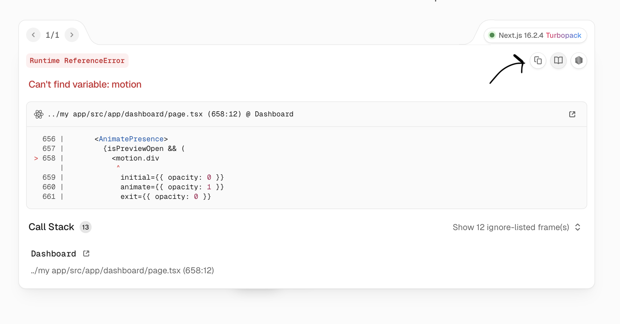
Did you get a big red error screen?
No worries! Errors happen all the time in development. If the app won't start or you see an error screen like the one below, just copy the error message (or the red block of text) and paste it straight back into your AI chat, like this:
"I got this error when trying to start the app: [paste error here]. Please fix it."
The AI will immediately know what broke and fix the code for you. Easy!
Verification
Your app is running and you can see it in your browser. You should see a landing page with Linktree-clone's name, and you can click around to see the dashboard, the public profile page, and all the different sections.
Step 3: Play around and make it yours
This is the fun part. Click on everything. Try adding a link. Try changing the background. Try switching tabs in the dashboard. Resize your browser to see how it looks on different screen sizes.
Some things to check:
Does the landing page look clean and professional?
Does the public profile page show the fake customer's name, bio, and links?
Do the social icons look like the real platform icons (Instagram logo for Instagram, etc.)?
Does the dashboard let you switch between Links, Profile, Appearance, and other tabs?
Does the phone preview on the right side of the dashboard update when you change things?
Do the link cards have a nice hover effect?
Does everything look good on a smaller screen? (Drag the edge of your browser window to make it narrower)
Is the text and icon color easy to read on the background you chose? (If not, see Step 4 to fix it!)
Things that are NOT connected yet (they'll be added in later modules):
Authentication — the login and signup buttons are there (on the landing page) but they don't do anything yet (we'll build the actual login pages and logic in a later module)
Payments — the Publish/payment buttons are there but don't process real payments
Deployment — your app is only running on your computer for now, not on the internet yet
Everything else should work. If you find something that doesn't look right or doesn't work the way you expect — that's normal, and it's easy to fix.
Step 4: Fix anything you don't like
Found something that looks off? Want to change a color, add a whole new section, or completely redesign a button?
This is your superpower. You don't need to know how to code, and you are entirely in control. If you don't like something, or if you just want to experiment with a new idea, just tell the Agent in plain English. It will build it for you on the spot.
Here are some examples of things you might say:
"The link cards look too flat, can you add more shadow on hover?"
"When I type an Instagram URL, it's not showing the Instagram icon — it shows a generic link icon instead. Fix that."
"The landing page main text is too large on mobile."
"The dashboard sidebar doesn't look right on a narrow screen."
"The preview is not synced with my choices on the dashboard"
"The payment button doesn't stand out enough from the regular links."
"I want to be able to change the color of the text and icons on the public page so it's readable on any background. Add a text color picker to the Appearance tab."
You can keep going back and forth with the Agent as many times as you want. Change colors, move things around, fix bugs — whatever you need. This is your app. Make it look and work exactly how you want.
This is called iterating — making small changes one at a time until everything works. Professional designers and developers do this too. Nobody gets it perfect on the first try. The difference is you have an Agent that makes changes in seconds instead of hours.
Step 5: Save your work
When you're happy with how everything looks and works, it's time to save it to GitHub. That way your progress is backed up and safe.
Save Your Work
You've made changes. Let's push them to GitHub so they are safe.
I'm happy with how Linktree-clone looks. Can you save all my work to GitHub? Stage everything, commit it with a clear message about what was built, and push it. Walk me through anything I need to do. I'm non-technical and copy-pasted this from a guide — please keep all explanations in plain English.
AI PromptSave to GitHub — Put this in your IDE
I'm happy with how Linktree-clone looks. Can you save all my work to GitHub? Stage everything, commi...
Click to expand
Verification
Your app's code is pushed to GitHub. You can verify by going to your repository on github.com — you should see a bunch of new files and folders that the Agent created.